
Mobile Responsive Checklist
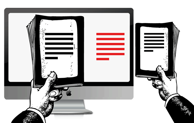
There’s every chance you’re reading this on your phone.
Almost half of our readers use their smartphones to read our content, if I were a gambler I’d bet your website has a similar percentage or even higher. This number will continue to grow.
In Australia alone, more than 17 million people (almost 80% of the population) own smartphones, checking those phones collectively eight billion times a day. Now, Australians are not only scanning their emails, checking Facebook and taking selfies. They’re increasingly using their phones to read ebooks, blogs, and your content.
When it comes to written information about your business that people will actually read, you need to comprehend how well your words come across on a phone.
Here is a mobile responsive checklist, and how to adjust anything that needs adjusting!
#1 Your Font Is Too Small
Size matters. When it comes to fonts, anyway. A small font translates into an eye-straining experience for any reader. You need to create a great reading experience by using a friendly font size.
Google developers recommend a base font size of 16 CSS pixels. As they put it, the best font size for your site is determined by the website itself. Now, when it comes to CTAs and other buttons, you can get away with something larger. This makes it clear that button has a meaning, and will take the readers to the next step.
A simple way to determine your font size is to compare your text size on a phone to the font size in a book, get them as close as possible and you’re set.

#2 Your Font Is Hard To Read
All fonts are equal but some are more equal than others. Some are optimal for print, while others are better online. A quick Google search will provide you with hundreds of options.
The main thing is to choose a font that meshes well with your business’s look and feel, and at the same time can be easily read on a phone.
#3 Your Background Is Distracting
Your background on your website should support, and not distract.
Fancy images, flash, design and colours may look great on a desktop but can look like a Jackson Pollock on a phone. Resist the urge to over do your design. Using white space is a powerful technique a writer can use to maximise their copy.
According to Treehouse, an online web design school, white space is “the portion of a page left unmarked, the portion that blanks, or the empty space on a page.”
Looking at this for a great example:
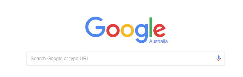
Google has mastered the use of white space. “That only works for Google”, you may be muttering, but remember Google hasn’t always been the behemoth they are today, they started just like you.
Maximise space and minimize distraction with good white space.
#4 Your Site Is Cluttered
Busy is messy. It seems like.
Put it this way, what if you were reading a book and along the side of the pages was opt-in forms or adverts. Would it be hard to focus? You’d think so.
The same holds true for your website. A cluttered website is a massive turn off. What functions on a desktop or even a tablet may not work well on a phone.
A great example I found is NPR (National Public Radio in the States). NPR provides a massive amount of content, and if anyone’s site had a right to be cluttered it’s theirs.
But check out this screenshot I’ve taken to see how they’ve arranged everything.
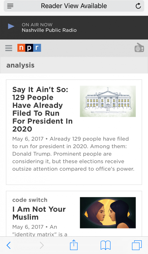
They have a functional single column layout. Now, when you click on the radio icon in the corner then an option drop down appears.
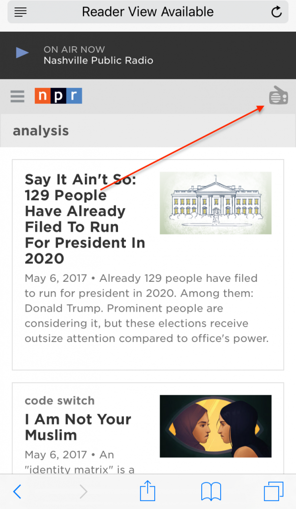
NPR, despite having a mass amount of content, creates a great user experience by optimising white space, providing quick access to their radio and easy navigation
#5 Your Site Is Unresponsive
Does your site look the same on an iPhone and iPad and an iMac?
First of all, that’s not good.
Your website needs to bend and shape no matter where it finds itself. It needs to look good on any device. This is called “responsive web design”.
Instead of commissioning your web team to build two websites (www.yourbusiness.com and m.yourbusiness.com) or creating an app, it’s best to make use of responsive design. Therefore, the way your website automatically adjusts the display to fit the screen it appears on.
This will create a fluid experience, and keep the visitors coming. Most of all, ask yourself the following:
- Does my site read like a book?
- Can people easily read it?
- Do I need to zoom in and out to read certain things?
So, looking for some more tips and tricks? Call SponsoredLinX on 1300 859 600 today for some more guidance, as we’re always happy to help!